Reese’s Billboards
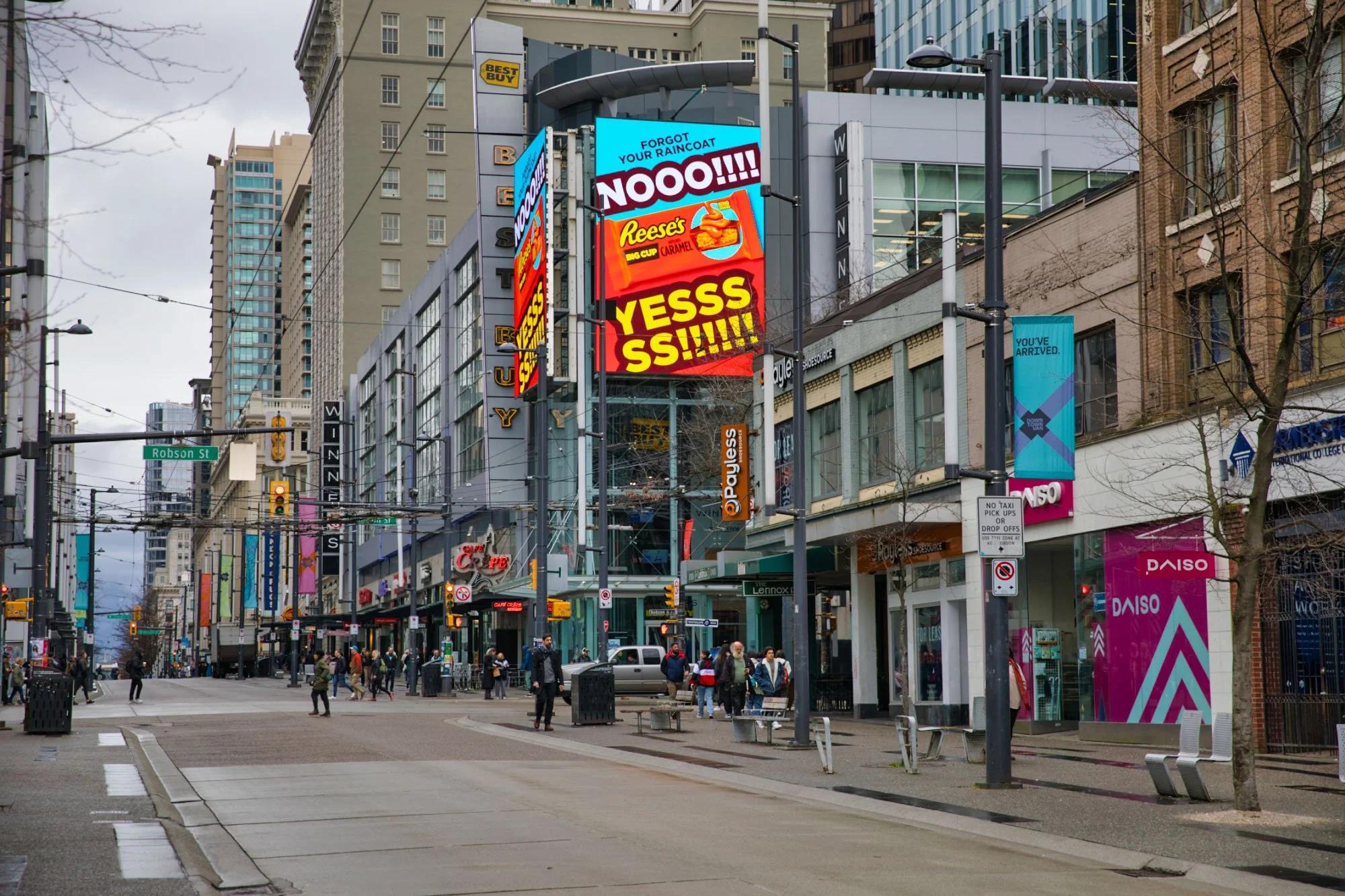
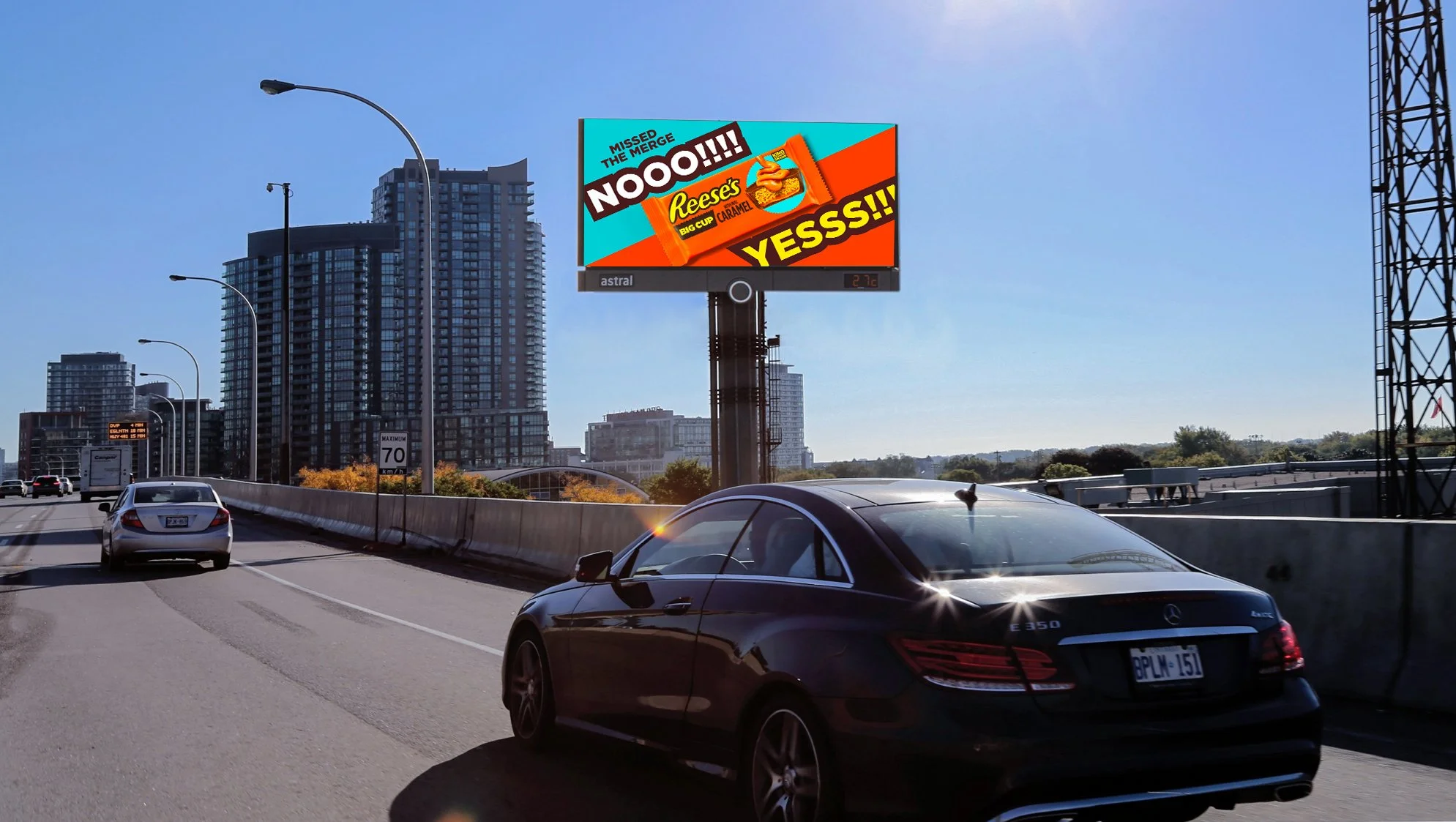
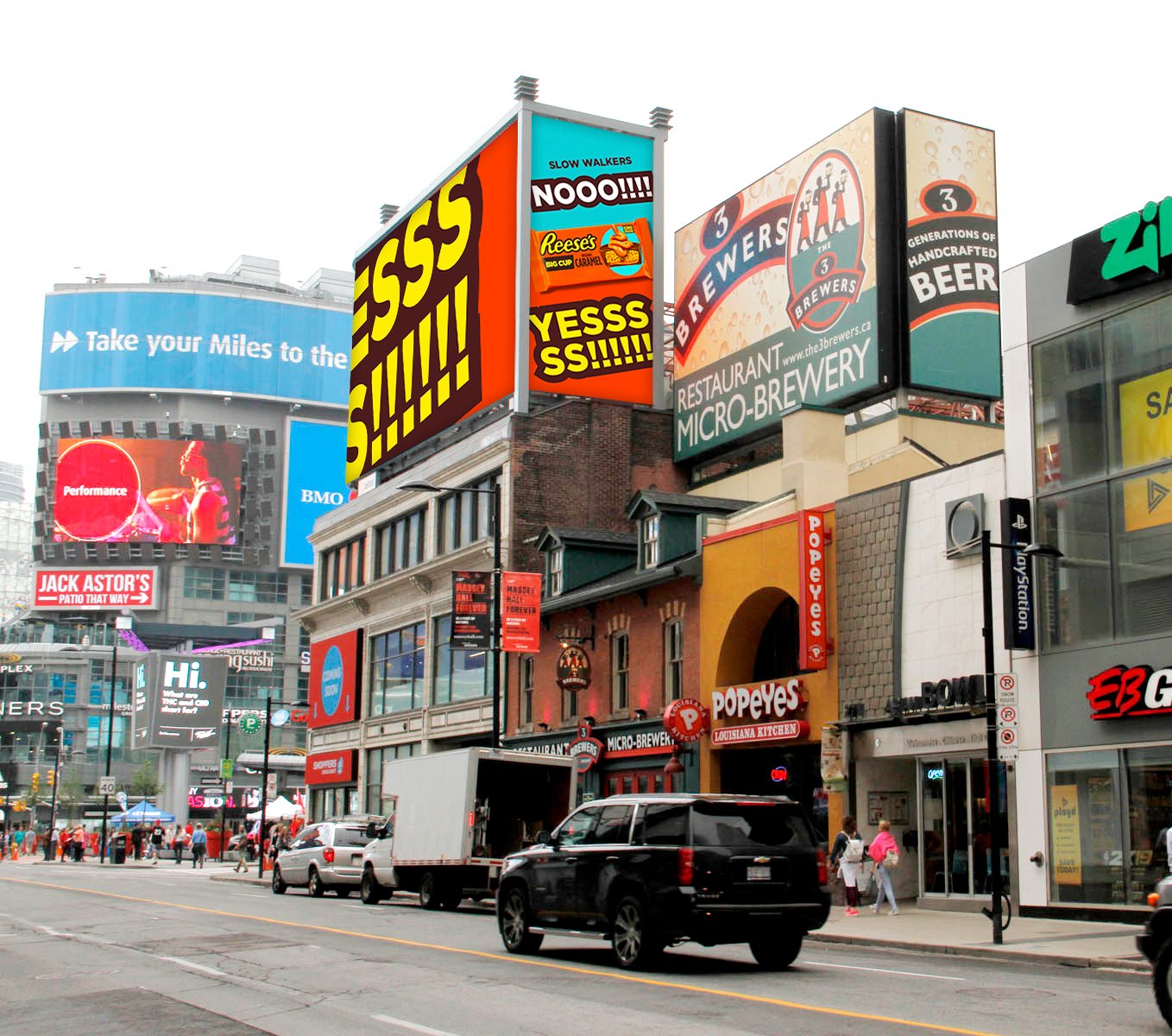
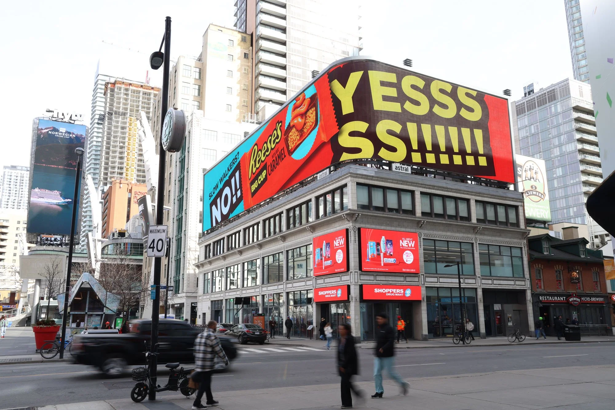
Hershey’s Reese’s is a top-selling candy brand worldwide, known for its iconic colour and distinctive visual identity. The client wanted to create an OOH execution in both Toronto and Vancouver, targeting high-traffic areas. I was given direction to create impactful, dynamic creative that would be instantly recognizable as Reese’s while working within the brand guidelines.
I knew I wanted to create something big and bold that would draw attention and communicate the message quickly. By pairing a bold, chunky font with a large product photo, I was able to create a dynamic visual that gives the impression that the creative is almost popping out of the board. Combining the brand’s iconic orange with a complementary blue helped create a strong, eye-catching visual while reinforcing the divide between the Yes and No sides quickly and effectively.